

Welcome to the Dynamic Recruitment KPI Dashboard, your essential tool for navigating the complexities of talent acquisition! This dashboard is designed to transform raw data into actionable insights, guiding your recruitment strategies with ease and efficiency.
Graphs Overview:
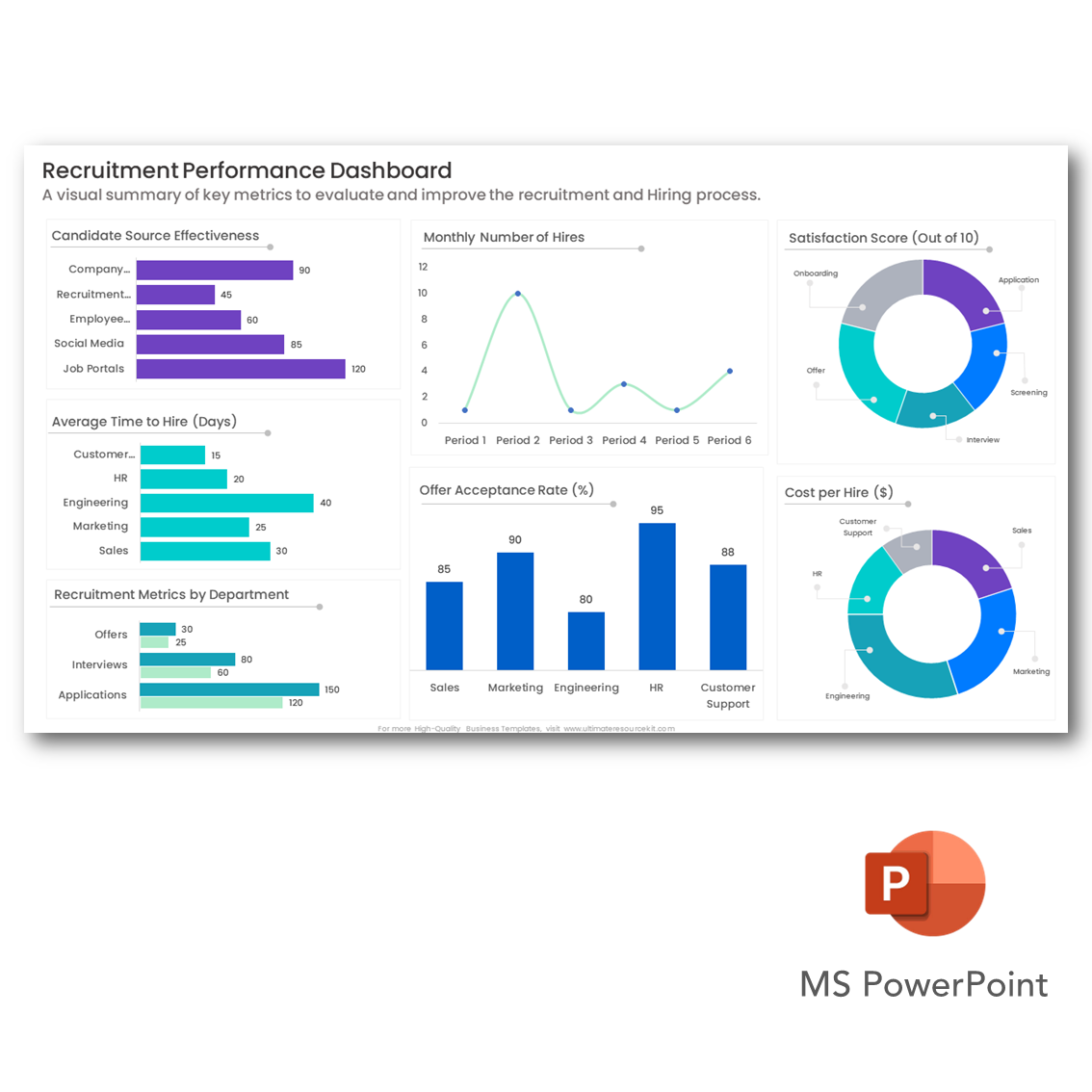
Single Horizontal Bar Graphs: Imagine having at your disposal two single horizontal bar graphs, each revealing valuable insights into your recruitment process. One graph tracks time-to-fill metrics, while the other delves into the intricacies of hiring costs. These graphs serve as invaluable guides, enabling you to streamline your recruitment processes and optimize costs effectively.
Double Horizontal Bar Graph: Now, let's focus on the double horizontal bar graph – your key to understanding the effectiveness of your recruitment channels. This graph provides a clear comparison between internal and external hires, helping you allocate resources wisely and maximize your recruitment ROI.
Curve Graph: The curve graph offers a dynamic visualization of candidate trends over time, empowering you to anticipate fluctuations in recruitment demand. By staying ahead of these trends, you can ensure that your talent pipeline remains robust and responsive to changing needs.
Histogram: Moving on to the histogram – your tool for understanding candidate qualifications and skills. This visualization highlights the most in-demand skills among your applicants, allowing you to tailor your job descriptions and recruitment strategies accordingly.
Pie Charts: Lastly, we have the pie charts – your insight into the diversity of your candidate pool. From gender to ethnicity to education level, these charts offer a comprehensive view of your talent landscape, guiding your efforts to foster a more inclusive workplace.
With the Dynamic Recruitment KPI Dashboard, you have everything you need to drive your recruitment efforts forward with confidence and clarity. So dive in, explore the insights, and unlock new opportunities for growth and success in talent acquisition!